The following article was authored by Marc Schwinges referencing several sources. The content was accurate as published, but graphs below update in real time.
Africa is Mobile
Almost every new person who wants a web site these days wants a mobile version of their website. With the high penetration of mobile and smart phone usage in South Africa and for that matter most of Africa, that’s doubly important.
According to the Cisco® Visual Networking Index Global Mobile Data Traffic Forecast for 2013 to 2018, there will be over 40 million Mobile Users in South Africa and 95 Percent of These will be Internet Mobile Users at just over 38 Million by 2018. 60 percent of mobile connections in South Africa will be ‘smart’ connections by 2018, up from the already high 30 percent in 2014. This is a growing trend being followed in much of Africa, while somewhat behind South Africa in terms of percentage.
As at the end of August 2014, 38.18% of Africa’s total web usage was coming from mobile devices according to StatCounter Global. That’s the highest percent of all continents in the world, and higher than the global average of 28.53%. at the same time. What is interesting is the steady global increase in the percentage of mobile connections worldwide, and the steady decrease in fixed line percentage. While this should not be confused with less users, what it does indicate is that of the ever growing global connected, an ever increasing percentage are opting for mobile based connections. Thats hardly surprising with the proliferation of mobile based devices now on sale.
Source: StatCounter Global Stats – Platform Comparison Worldwide Market Share – Updated Live.
What’s most startling is that a massive 55.6% of South Africa’s traffic is mobile based at the end of August 2014 making mobile-based traffic the highest traffic percentage wise in South Africa! Tablet traffic makes up around 5.62% of South Africa’s Internet traffic presently.
Source: StatCounter Global Stats – Platform Comparison South African Market Share – Updated Live. In South Africa mobile connections have exceeded fixed line connections a year ago, and remain in the lead.
This trend is duplicated in many other leading African Countries as can be seen below:
Source: StatCounter Global Stats – Platform Comparison Nigerian Market Share – Updated Live. In Nigeria mobile connections have exceeded fixed line connections since the end of 2011, and remain firmly in the lead. This massive country went mobile connection heavy at the very start!
Source: StatCounter Global Stats – Platform Comparison strong>Kenyan Market Share – Updated Live. In Kenya mobile connections have also exceeded fixed line connections a year ago, and remain firmly in the lead.
Responsive Web Design
Do we now have to create one design for the BlackBerry, another for the iPhone, (not to mention iPhone 5 or 6 or the extra lrage iPhone 6), the iPad, netbook, Kindle — when all the screen resolutions and sizes are completely different? What about the ever increasing resolutions offered for laptops and desktop screens? 10 years ago, we designed for the web at 800 pixels across, then we increased that to 1024 pixels across, and now the sky is the limit! In the next five years, we’ll likely need to design for a number of additional inventions. When will the madness stop? It obviously won’t.
For many websites, creating a website version for each resolution and new device would be impossible, or at least impractical.
Responsive Web Design (RWD) is the approach that suggests that design and development should respond to the user’s behaviour and environment based on screen size, platform and orientation. The practice consists of a mix of flexible grids and layouts, images and an intelligent use of CSS media queries. As the user switches from their laptop to tablet, the website should automatically switch to accommodate for resolution, image size and scripting abilities. In other words, the website should have the technology to automatically respond to the user’s preferences. This would eliminate the need for a different design and development phase for each new gadget on the market.
In a more technical way a site designed with RWD adapts the layout to the viewing environment by using fluid, proportion-based grids, flexible images, and CSS3 media queries, an extension of the @media rule.
The flexible grid concept calls for page element sizing to be in relative units like percentages, rather than absolute units like pixels or points.
Flexible images are also sized in relative units, so as to prevent them from displaying outside their containing element.
Media queries allow the page to use different CSS style rules based on characteristics of the device the site is being displayed on, most commonly the width of the browser.
Server-side components (RESS) in conjunction with client-side ones such as media queries can produce faster-loading sites for access over cellular networks and also deliver richer functionality/usability avoiding some of the pitfalls of device-side-only solutions.
What are the issues with Responsive Web Design?
It should be understood that OLDER browsers (IE 8 and earlier, as well as old cell phones browsers which were not updated), may NOT be able to view every responsive web site, as the new code used to build responsive sites is not supported by these browsers. This does currently have a negative affect in Africa where a fair proportion of older browsers and phones are in circulation and use. Its hard to work out the exact number of older phones in the market space that might not currently support all responsive web sites, but we can tell that in Africa as a hole, around 2.85% of traffic sill comes from the old Internet Explorer 8. Many banks (including FNB in South Africa) have decided not to allow access via IE 8 and similar old browsers anymore.
Despite it possibly affecting as much as 10% of the potential audience, it is my recommendation to build for responsive web. The 10% may be inconvenienced for now, it will undoubtedly be forced to migrate to newer tech real soon, and together with the other users enjoy a more rich experience suited to their screen size.
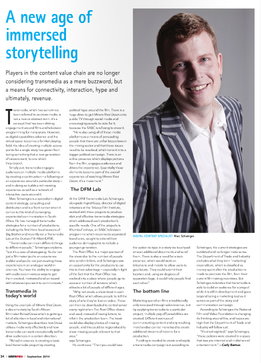
Article by Marc Schwinges – Transmedia Consultant Africa